Case study · 2024–25
CASE STUDYWeb3 onboarding · Fiat→crypto checkout · 6 months

Rebuilding the buy/sell flow 17M people use to enter Web3.

A six-month revamp of the embedded checkout 350+ partner apps use to take users from fiat to on-chain. We reframed a payment surface as a trust surface — and rebuilt the system so partners ship faster.

Role
Lead Product Designer
Timeline
6 months · 2024–25
Team
2 Designers · 3 Frontend Engineers
Surface
Embedded widget · Web · iOS/Android in-app browser
+18.4%
Order completion (target)
−27%
Drop-off at KYC step
4.6/5
Partner CSAT (post-launch)
350+
Partner integrations live
01/22 — Overview

A checkout that earns trust before it asks for money.

Six seconds of doubt at the wrong step and a user is gone — along with the partner's onboarding promise.

Tl;dr

We rewrote the widget around three jobs — configure intent, prove identity, complete payment — and stopped pretending they were one screen with three states.

Not a re-skin. A re-architecture of the flow, a new design system, and a measurement loop that lets us argue with data instead of opinion.

The Surface
An embedded checkout, not a website.
A 450x680 iframe inside someone else's app. The user thinks they're still in the partner — every visual choice carries that handoff.
The Stakes
The widget is where partners get paid.
Every point of conversion is real partner revenue. Renewals are decided by what they see in the funnel chart.
The Job
Make regulation feel like checkout.
KYC, AML, payment routing, fees, slippage — surfaced only when they help, never as a wall.
02/22 — Problem statement

A widget that converted despite its design, not because of it.

Users were clearing the flow on muscle memory and motivation. Anyone less determined fell out — the cohorts we most needed to convert.

Diagnosis

The widget worked for users who already understood Web3. It punished everyone else.

First-time fiat-to-crypto users dropped 4.2x more than returning ones, almost entirely at three friction points: payment selection, KYC, and the "is this stuck?" gap during processing. A trust problem disguised as a usability problem.

Symptom 01
Conversion stalled at 41% despite traffic growth.
Each new partner inherited the same drop-off pattern. Structural, not partner-specific.
Symptom 02
73% of tickets clustered on three steps.
"Why was I rejected?", "Where is my money?", "Why do you need my ID?"
Symptom 03
Partners were reskinning the widget themselves.
CSS workarounds to hide what they considered confusing UI. The surface was failing them too.
03/22 — Before & After

The transformation, screen by screen.

Compare the old checkout against the new design. Drag to explore the differences.

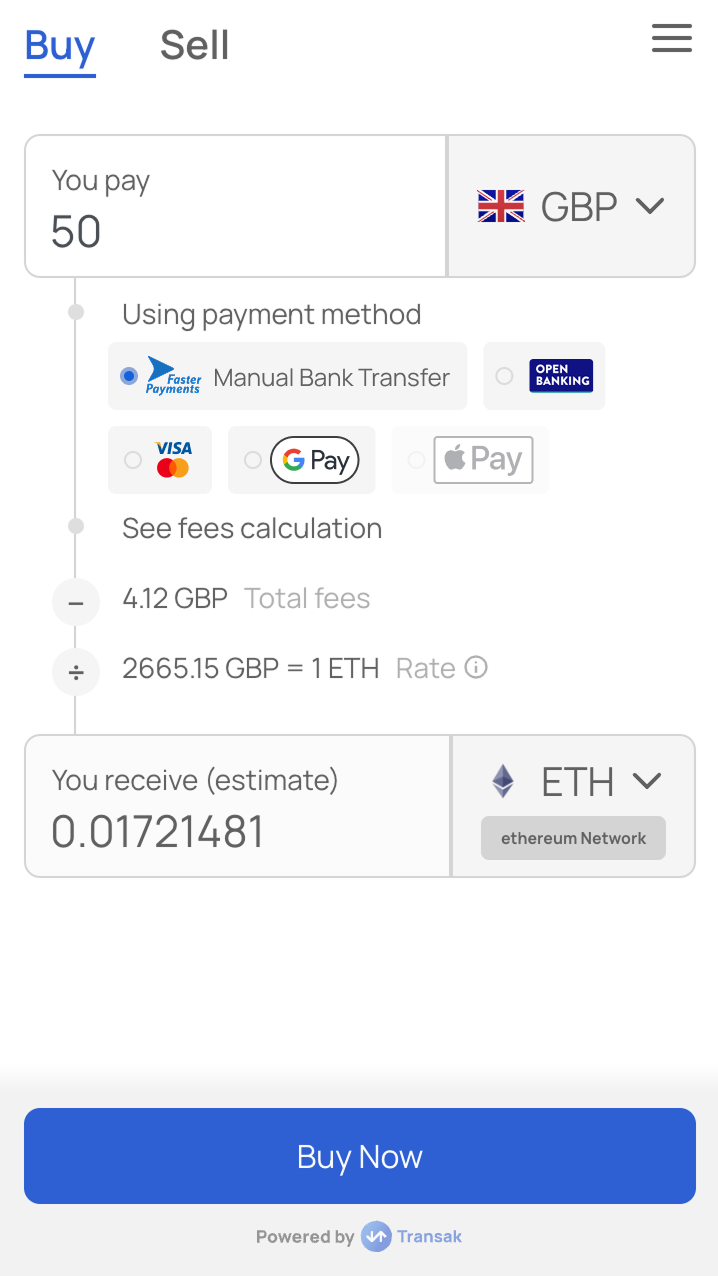
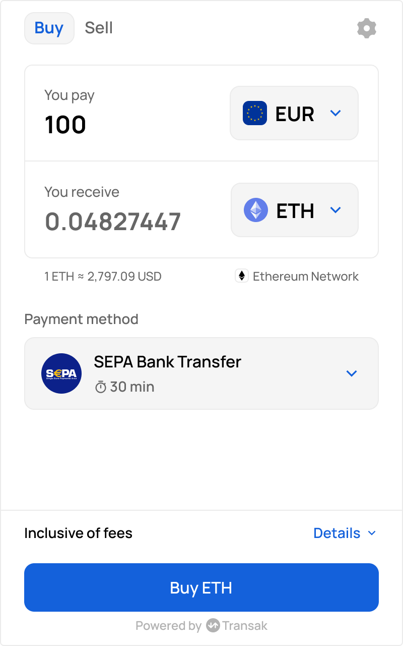
1. Main Entry Screen - Payment Methods

Old: All payment methods visible, cluttered
New: Single selected method, cleaner focus
After
Before

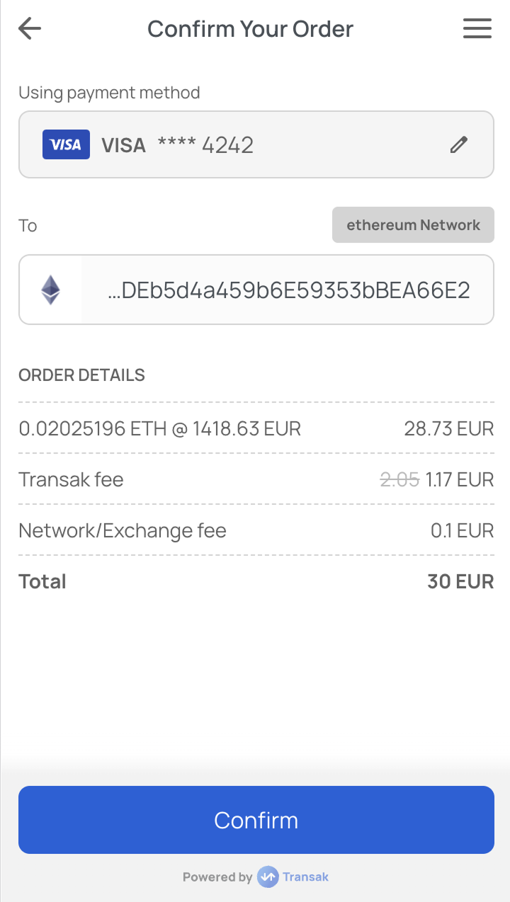
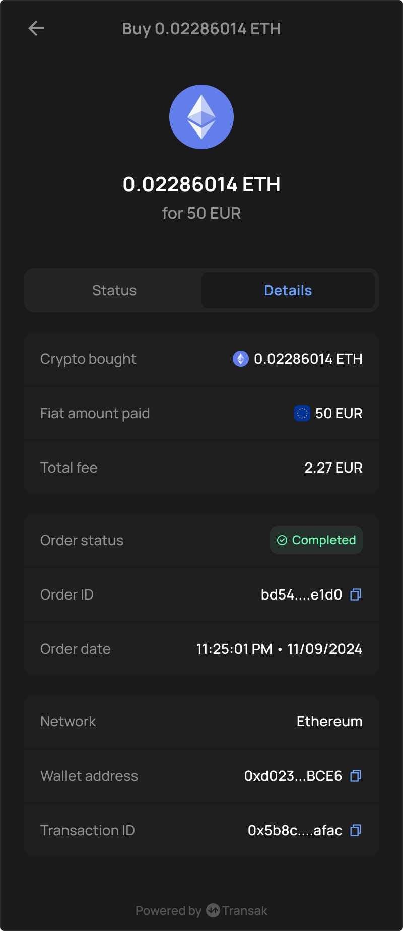
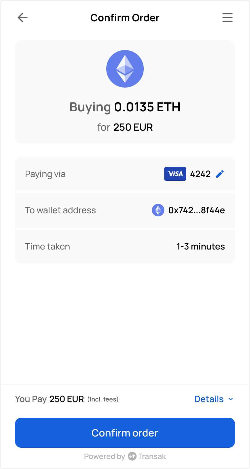
2. Order Confirmation

Old: Dense fee breakdown, cluttered layout
New: Streamlined confirmation, clear hierarchy
After
Before

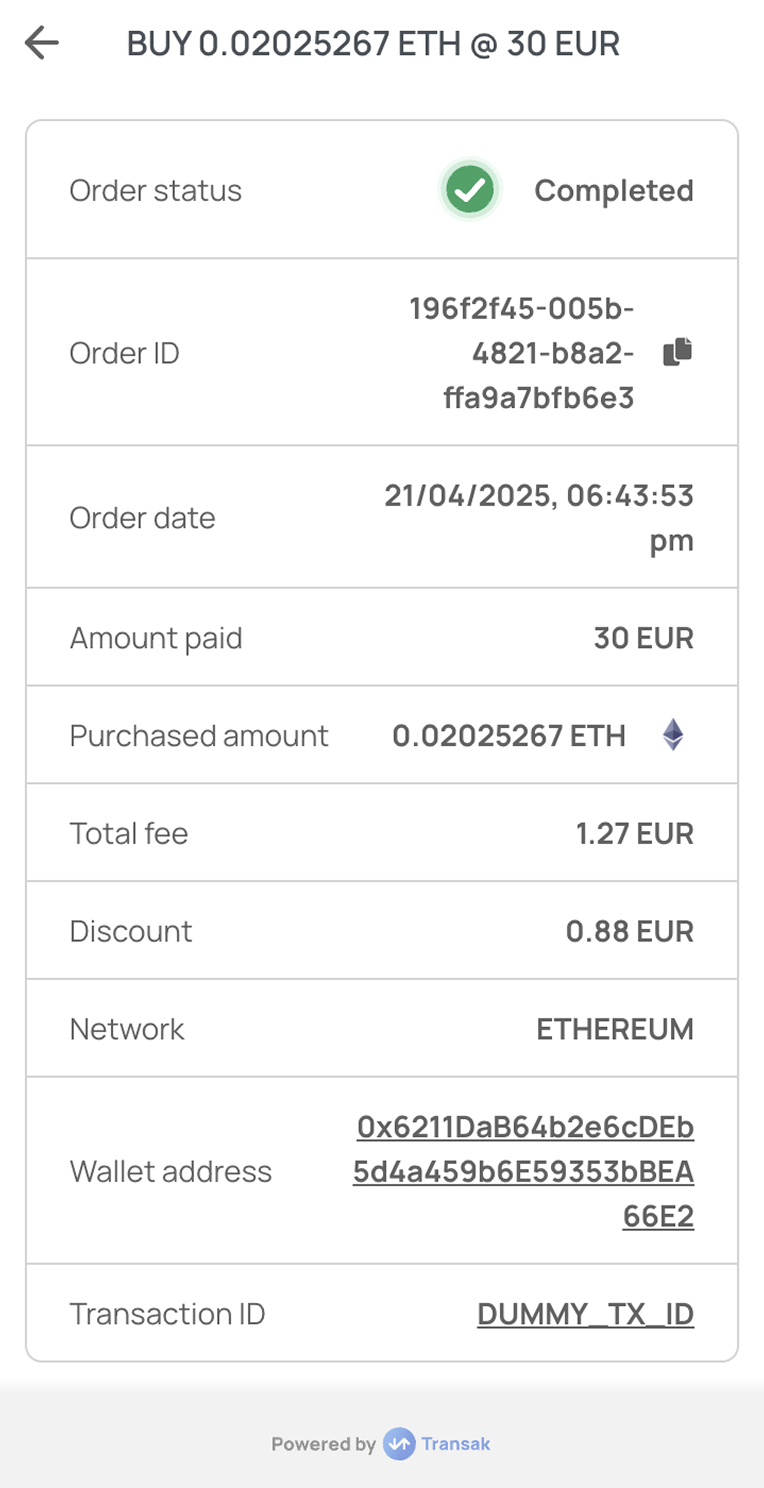
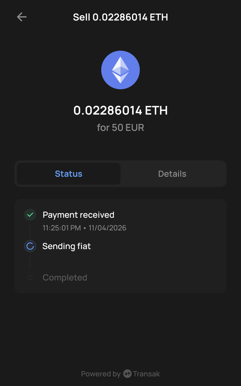
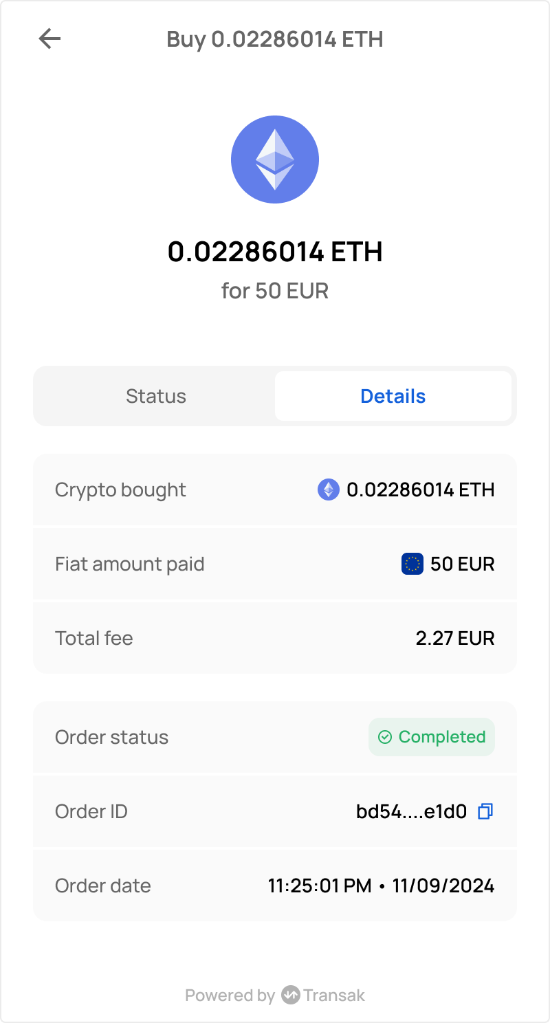
3. Order Status

Old: Dense table layout, information overload
New: Card-based design, visual hierarchy
After
Before

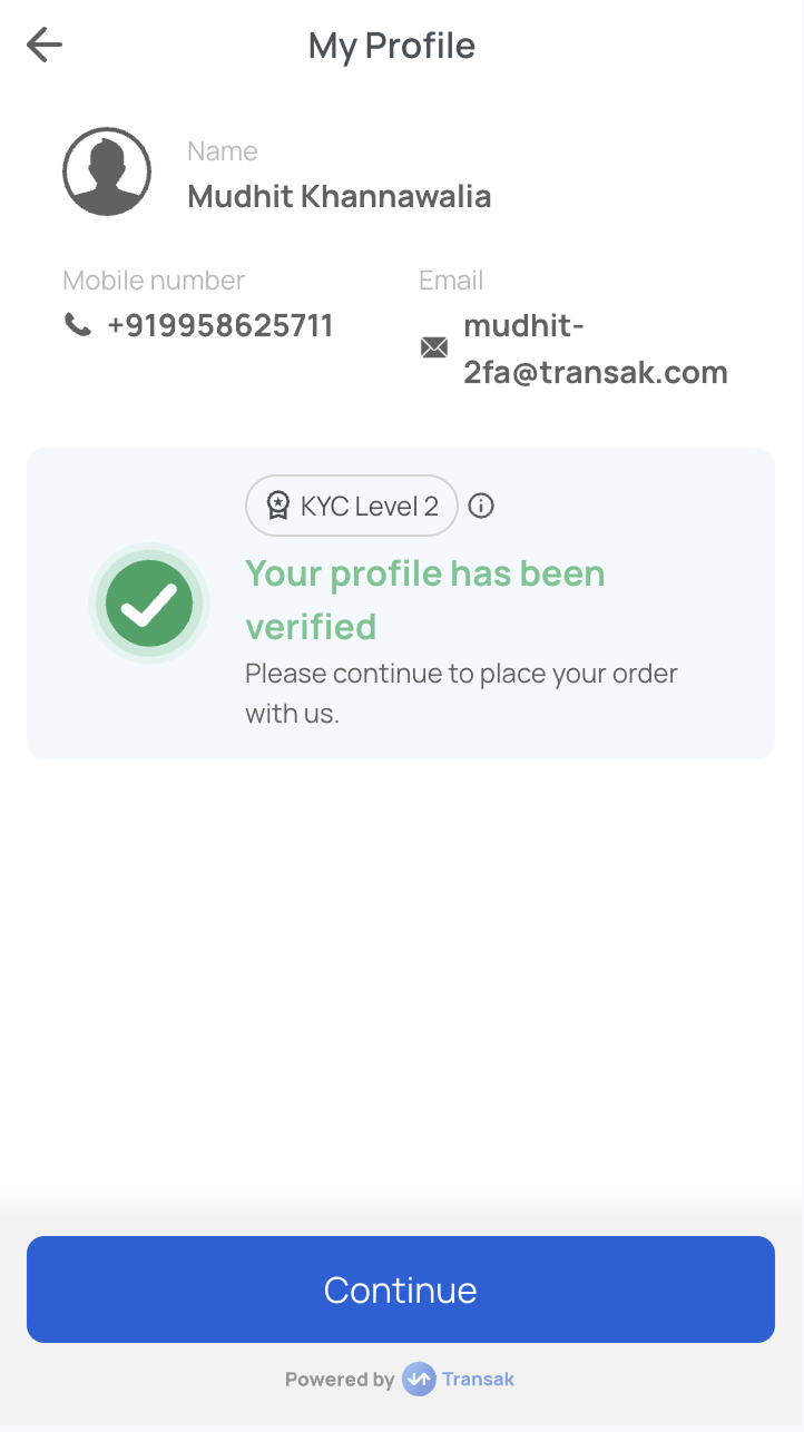
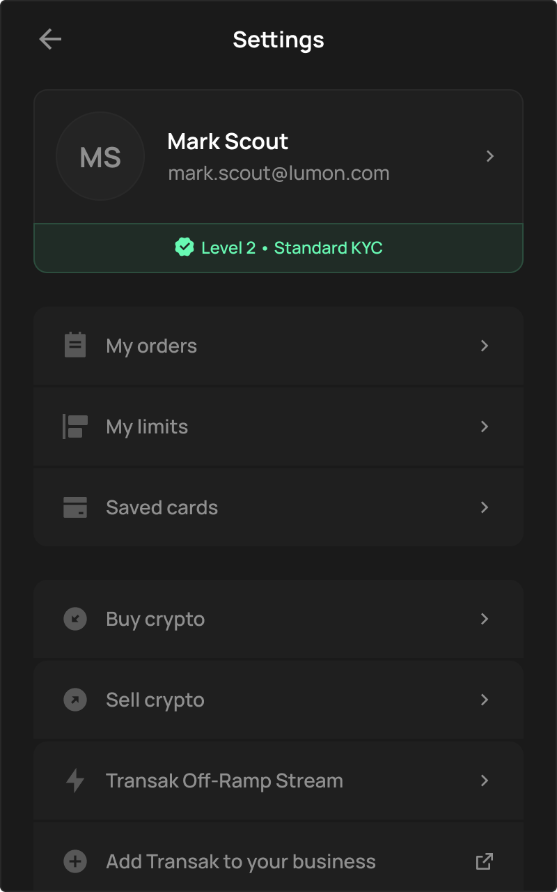
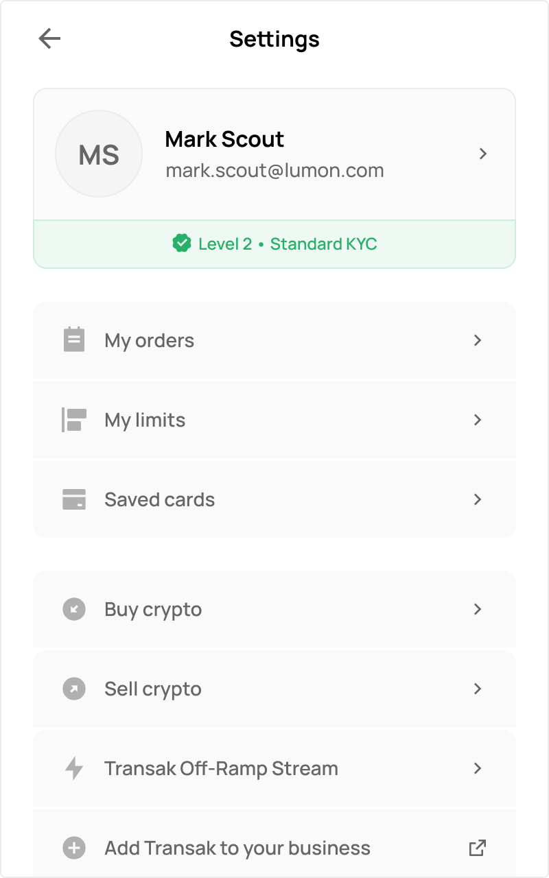
4. Profile & Settings

Old: Basic profile view with verification
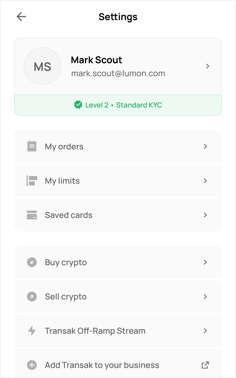
New: Full settings menu with account options
After
Before
03/22 — Design principles

Design Principles

Rather than redesigning individual screens, I established a set of principles that guided every visual and interaction decision throughout the experience.

01

Clarity Over Density

Reduce cognitive load by prioritizing only the information users need to make the next decision.

02

Trust Through Transparency

Make transaction states, verification requirements, and system feedback visible and understandable.

03

Brand Flexibility at Scale

Enable partners to customize the experience while preserving consistency, accessibility, and usability.

12/22 — Design exploration

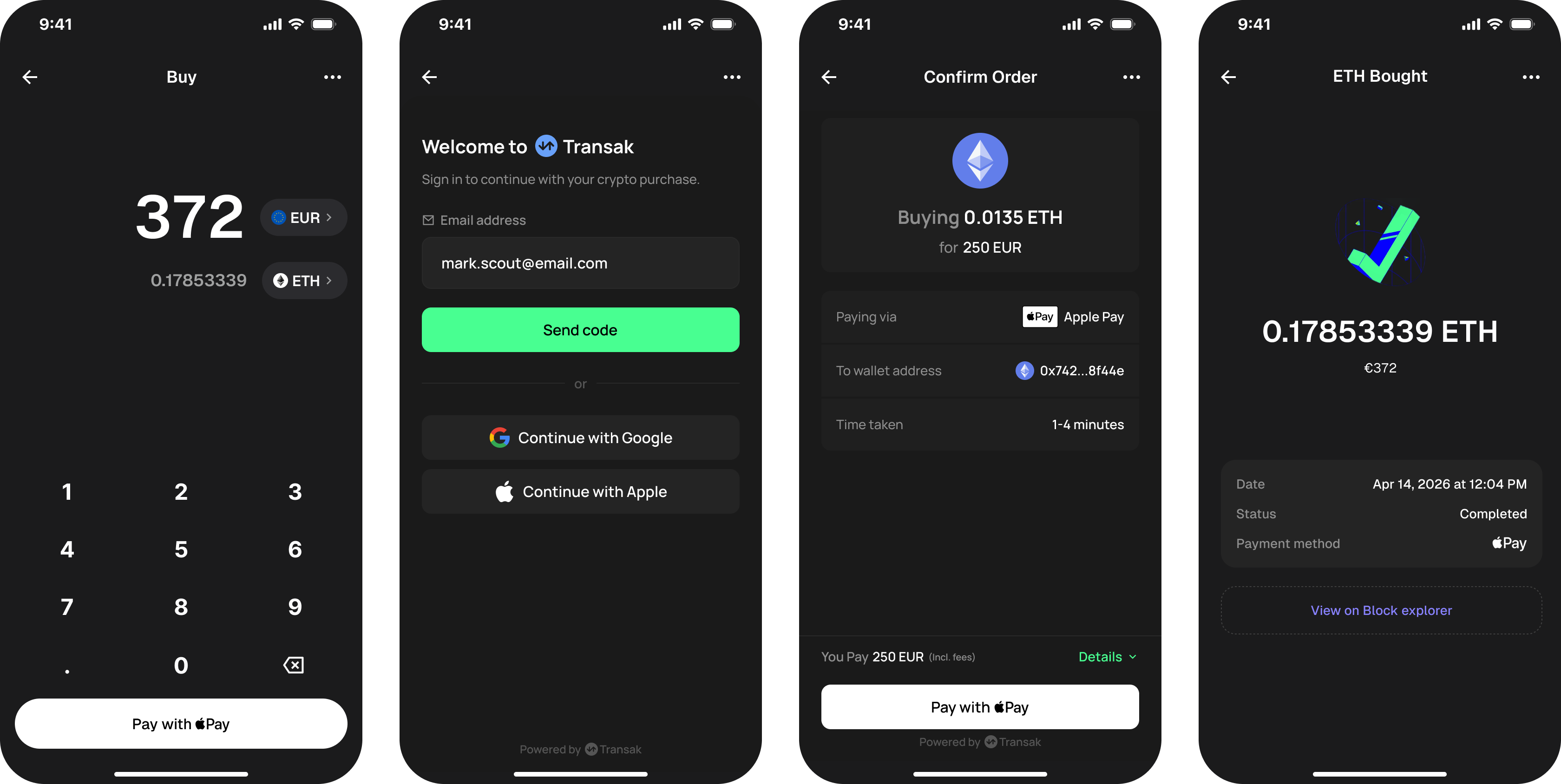
The redesigned widget, screen by screen.

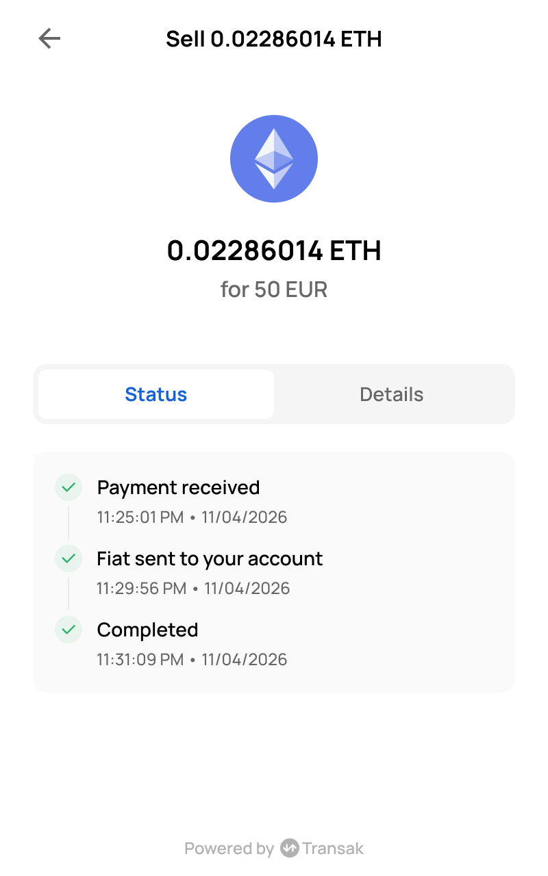
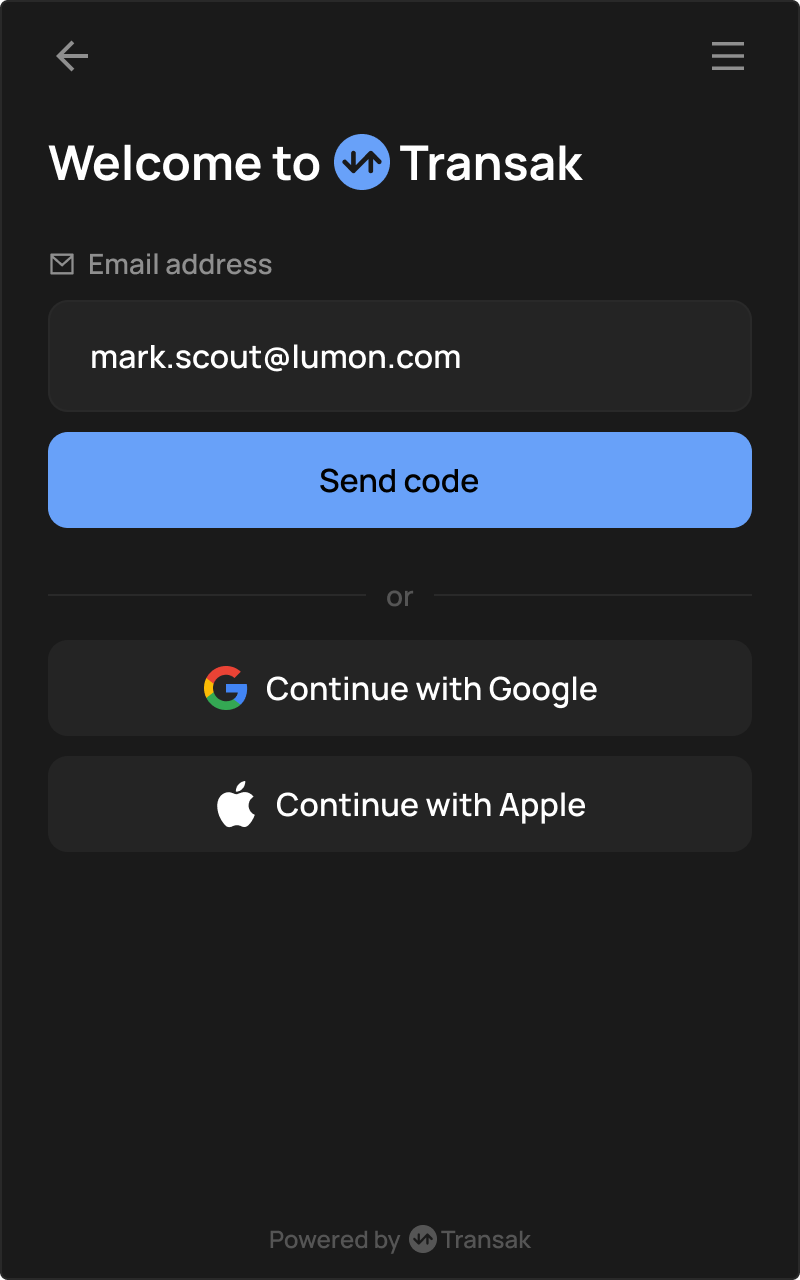
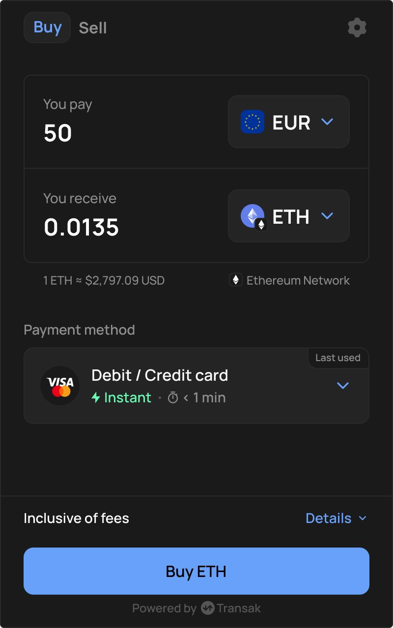
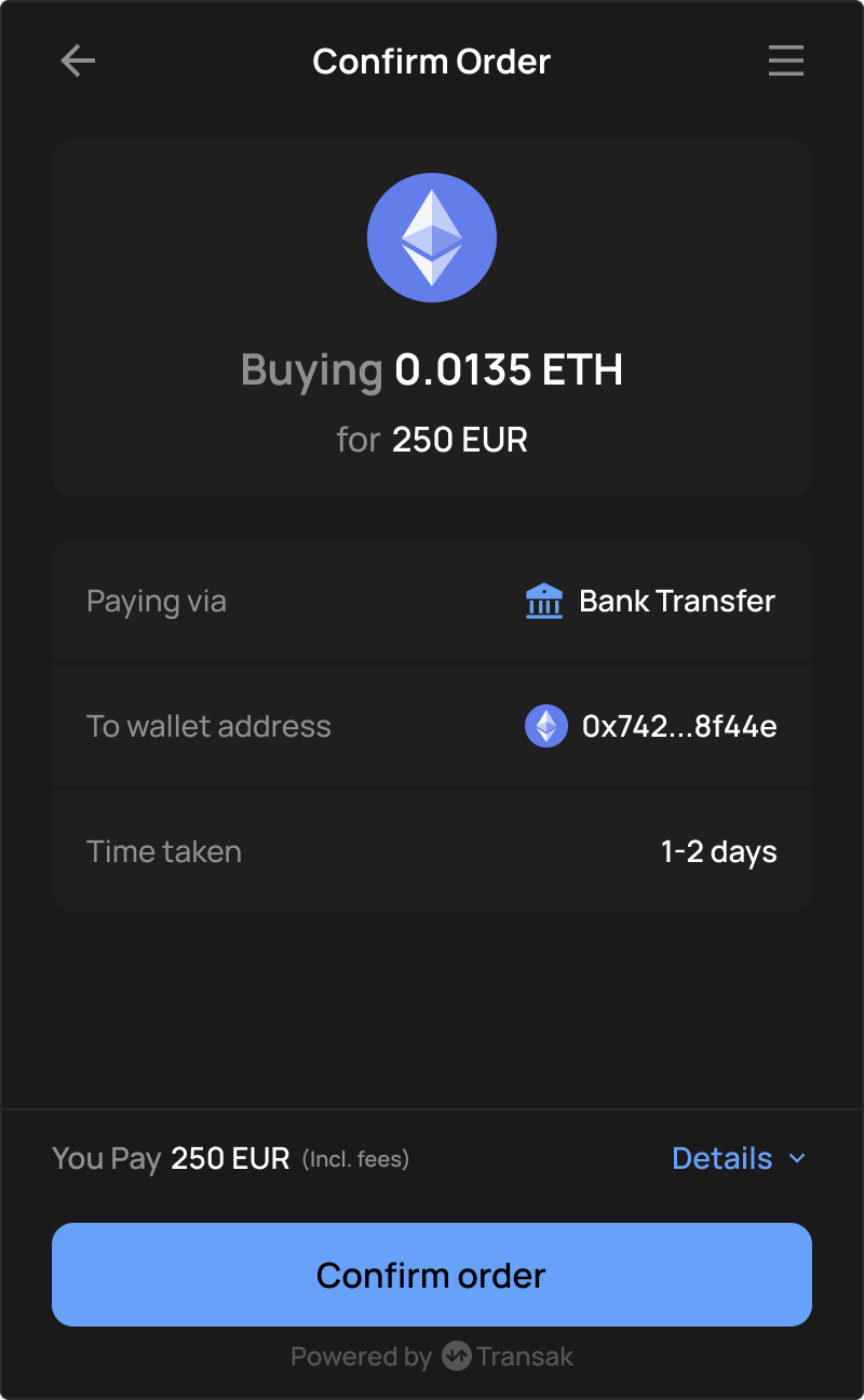
A walkthrough of the shipped flow — from sign-in to settlement — captured from production.

Light theme

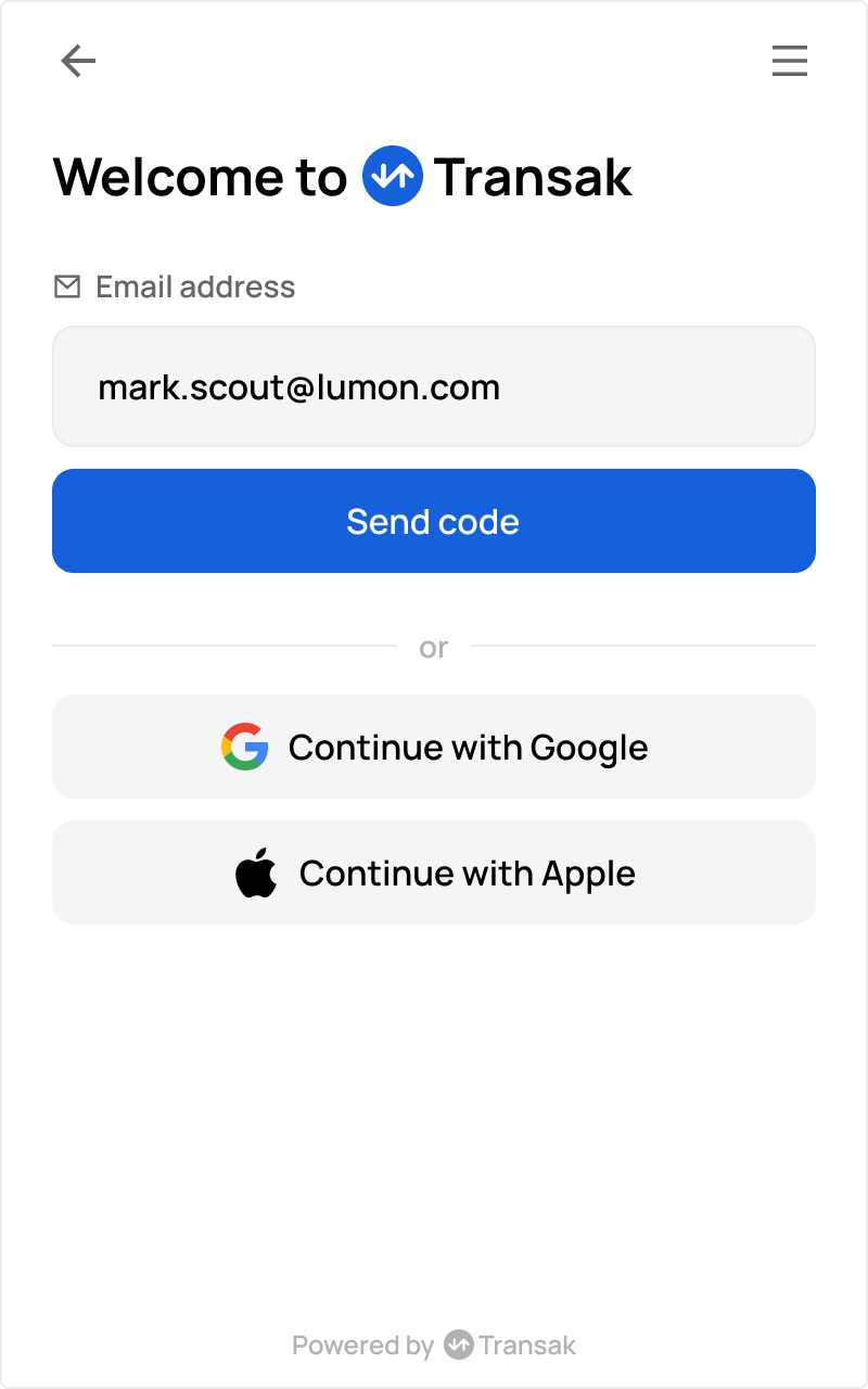
01 - Sign in / sign up
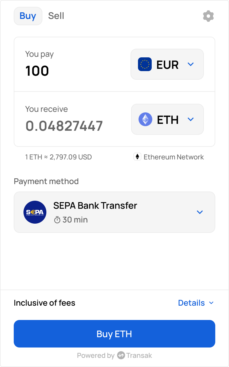
02 - Buy amount / payment method
03 - Confirm order
03 - Confirm order
04 - Profile / KYC status
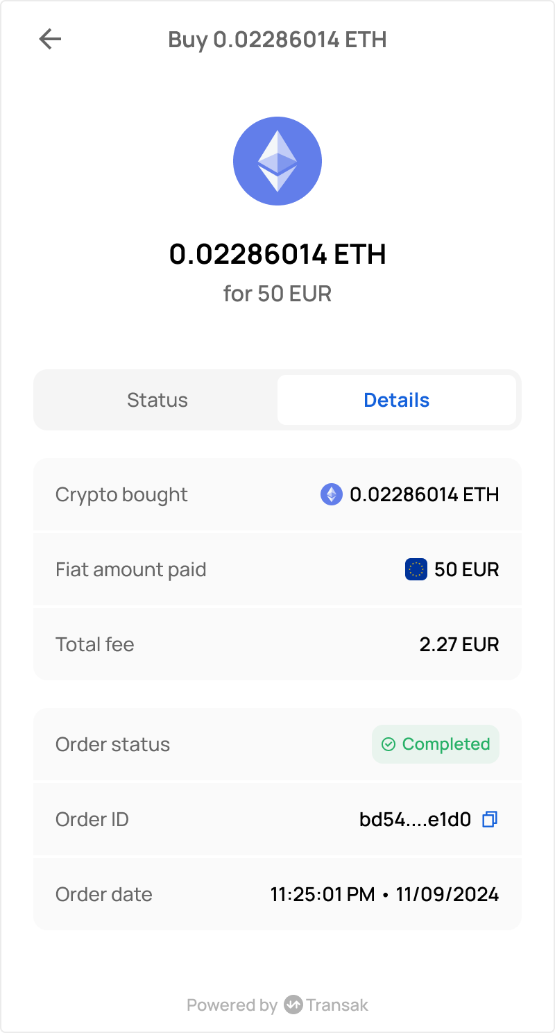
05 - Order completed
06 - Sell flow status

Dark theme

01 - Sign in / sign up
02 - Buy with card payment
03 - Bank transfer option
04 - Profile / KYC status
05 - Order completed
06 - Sell flow status
17/22 — Design System

Typography — Creating clear reading paths.

A deliberate hierarchy that guides users from discovery to decision without cognitive friction.

Design Principles
01

Primary actions dominate attention

The CTA button uses bold weight, full width, and color contrast that meets WCAG AAA. Transaction amounts and confirmation states use the largest effective size. Scannability improves when the eye lands on decisions first.

02

Supporting info doesn't compete

Labels, fees, and secondary details use reduced color saturation and lighter font weight. They support decision-making without demanding attention. Visual weight hierarchy is explicit in every line.

03

Compliance is visible, not overwhelming

Legal and regulatory text is readable and present—never hidden—but uses a smaller scale and greyed tone. Trust comes from transparency, not obfuscation.

Before & After Comparison
Dense: All methods equal visual weight
Clear: Primary action dominates attention
After
Before
Optimal Reading Flow
Transaction Details
Payment Method
Verification Info
Primary CTA
18/22 — Design System

Color Tokens — Semantic clarity through systematic constraints.

A minimal, intentional palette that communicates state, priority, and function. Each token serves a specific semantic purpose across light and dark themes.

Light Mode
Background
Widget
#FFFFFF
Page
#E6E6E6
Surface
Regular
#F5F5F5
Light
@50%
Brand
#1461DB
Success
#27B067
Error
#F32139
Border
Regular
#EBEBEB
Light
@50%
Brand
#1461DB
Error
@16%
Text + Icon
Primary
#000000
Secondary
#666666
Brand
#1461DB
Dark Mode
Background
Widget
#1A1A1A
Page
#000000
Surface
Regular
#242424
Light
@50%
Brand
#68A1F9
Success
#68F9B3
Error
#FF6F7F
Border
Regular
#292929
Light
@50%
Brand
#68A1F9
Error
@16%
Text + Icon
Primary
#FFFFFF
Secondary
#8F8F8F
Brand
#68A1F9

Semantic Intent

Each token serves a specific purpose within its context. Light mode uses darker, more saturated brand colors for contrast against light backgrounds. Dark mode inverts this logic, using brighter accent colors against dark surfaces. This semantic approach ensures accessibility, readability, and consistent visual hierarchy across all implementations.

Why this work landed on a roadmap, not a backlog.

Three forces converged in early 2024 that turned a "nice to have" redesign into the highest-leverage product investment of the year.

Force 01

Partner concentration risk.

Top 10 partners drove ~58% of volume. Two were evaluating in-house alternatives. The widget had become the deciding artifact in renewal talks.

Force 02

Regulatory tightening — MiCA, FCA, US state frameworks.

New disclosure and KYC-tier rules weren't deferrable. We had to rebuild proactively, or rebuild reactively under deadline pressure.

Force 03

Platform pivot toward white-label, SDK-first delivery.

From "branded widget" to "embedded primitive." The visual system needed to flex to partner-themed surfaces without breaking compliance.

Force 04

Internal velocity tax.

Every customization took weeks instead of days. No system. Engineering's design-debt list ran to 47 items.

18/22 — Partner customisation

White-label the entire flow. In code, in minutes.

Six configurable parameters control color, dark mode, logo, defaults, and payment routing. Partners go from setup to live in a single PR.

Implementation

Rather than asking partners to fork and maintain, we inverted the architecture: a single design system, infinite expressions.

Partners pass a config object at instantiation. The widget reads semantic tokens, applies them through CSS custom properties, and every screen adapts instantly. No rebuild. No deploy delay. Changes land in seconds.

const transak = new Transak({ apiKey: 'your-key', // Six customization parameters primaryColor: '#1461DB', // Brand accent darkMode: true, // Light/dark toggle logoUrl: 'https://...', // Partner branding defaultToken: 'USDC', // Recommended crypto defaultFiat: 'USD', // Currency default paymentMethods: ['card', 'ach'] // Available options });

Live partner integrations

Trust Wallet Integration

Trust Wallet custom integration

Full dark theme with Trust Wallet branding. Custom green accent color (#0CC786) flows through all screens.

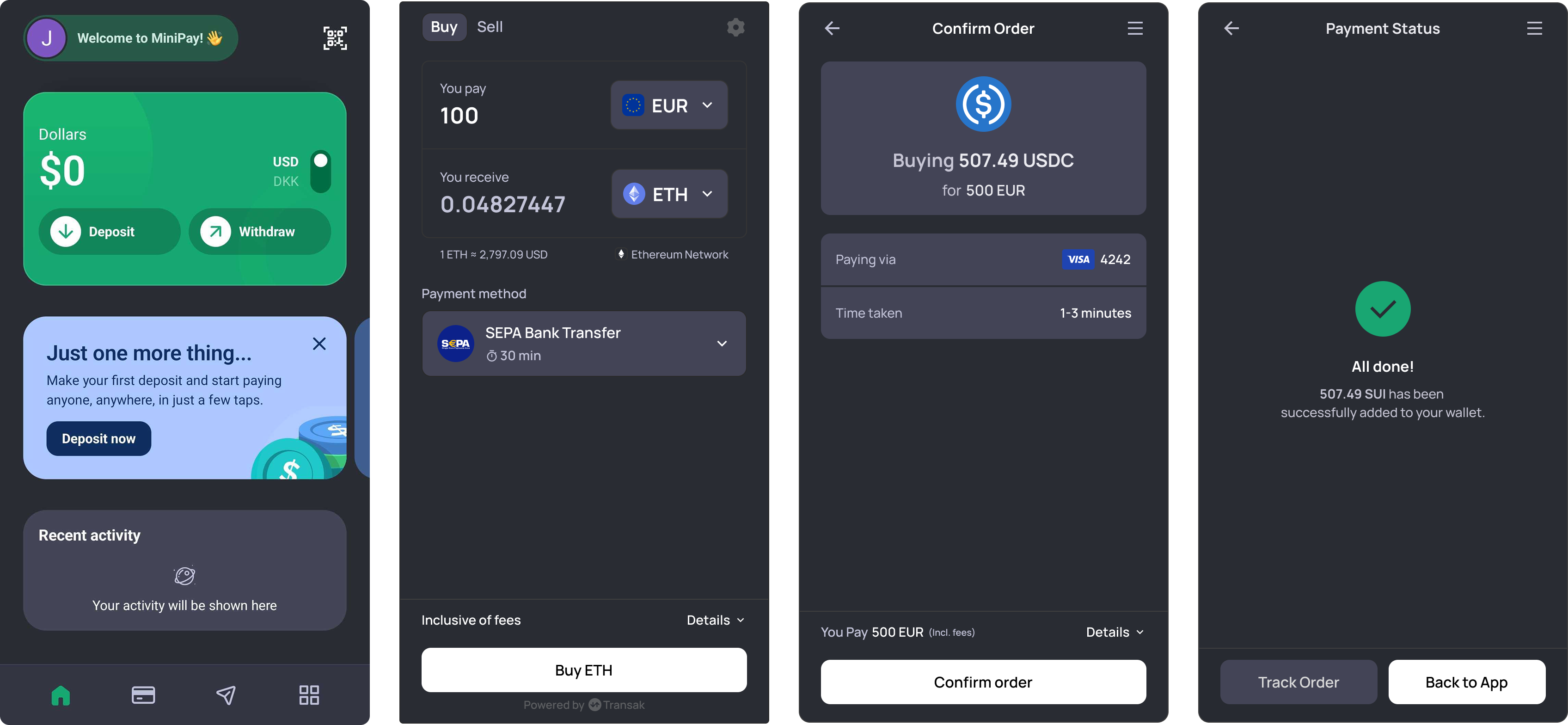
MiniPay Integration

MiniPay custom integration

Embedded within MiniPay's native wallet experience. Green branding with contextual deposit prompts.

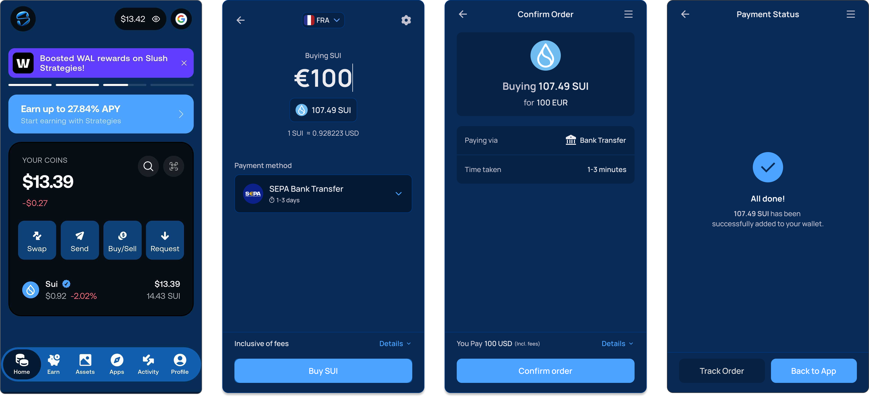
Slush Wallet (SUI) Integration

Slush SUI custom integration

Deep blue theme for Slush wallet. Native SUI token defaults with SEPA bank transfer as primary payment.

Dark theme + brand blue
One config object
Partners pass their brand color, and the entire widget cascades through 40+ derived tokens. No CSS. No complexity.
350+ live integrations
Already theme customized
From gaming studios to fintech platforms — each one running the exact same codebase, visually unique. Zero fragmentation.
22/22 — Outcomes

What we learned, and where we're headed.

The metrics speak for themselves — but the real impact is in how partners now build with us.

Metric - Conversion
+18.4% order completion
Measured against the previous widget over a 90-day window post-launch, across all new users.
Metric - Friction
-27% KYC drop-off
The largest win. Better messaging and progressive disclosure meant users understood why they were asked.
Metric - Partners
4.6/5 CSAT
Post-launch survey of 80+ active partners. The themeing system was a major highlight.
Reflection

Trust compounds. The moment a user feels understood — that the system is built for their situation, not against their goals — conversion becomes inevitable.

What started as a checkout redesign became a template for how Transak thinks about partner integration. We shipped a system, not a feature. The widget will change a thousand times. The philosophy won't.

Built with v0